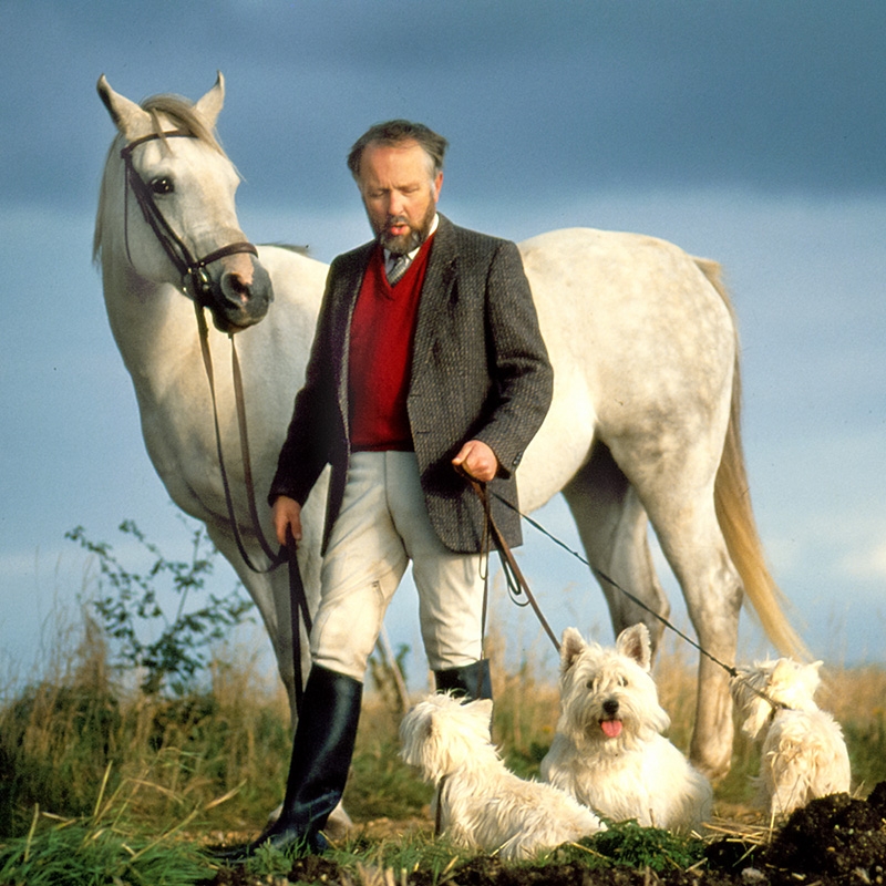
I have recently revived my urge to take and show the kind of images that I really like myself, rather than trying to guess what photos will be popular and showing those. Of course, I hope that my readers and viewers will like the photos I like. Above all I like to take photos of people, preferably candid or at least natural and unposed. And I like the photo to tell a story and have more of a message than just, “This is Joe.”
I have just finished putting together a book entitled PEOPLE. At the moment it’s just a one-off printed book that I compiled actually because a company gave me a voucher which covered the printing in exchange for producing a book and giving them a review. I’m waiting to receive the printed book back before I review the company. If it’s good, I’ll probably do a blog post about it. I also plan to do an e-book version which I’ll let you know about when it’s done. In this blog post I would like your view regarding color vs. black and white.
The story behind this photo
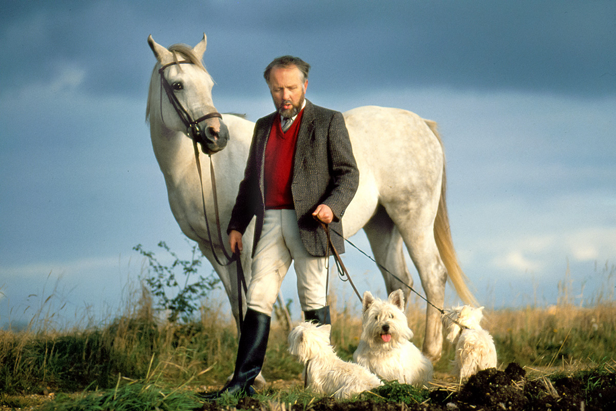
This photo was taken in 1990 or 1991. It was shot on color transparency film (Fujichrome 50) with an Olympus OM4-T camera and I’m guessing a 100mm f2.0 Olympus lens (one of my favorites of all time). I was photographing and writing a case study on a Data General (remember Data General??) customer, the Kennel Club, Britain’s largest organization dedicated to the welfare of dogs. The Kennel Club was using Data General mini-computers and liked them and were willing to say so.
Rather than take the usual boring photo of someone in the Kennel Club sitting at a desk with a Data General computer monitor on it, I decided to do something different. I was living in Cambridge, England at the time. I called up some local kennels and happened to get in touch with the gentleman in the photo. I’m afraid I have long since forgotten his name but he was delightful and obliging. So I went to his nearby farm and he walked his horse and his three Westies (West Highland White Terriers) out into a plowed field and was just walking without much direction. It was a horribly cloudy day and it all looked rather drab and dreary.
Then the sun came out beneath the lowering black clouds and created that wonderful light that I’ve really only seen in England and sometimes in France. I had a few minutes only with this light and then it was gone.
I didn’t really know if I had the shot or not. I had to wait to get the film processed. When I got the slides back I was thrilled. So was the editor. The photo was used on the cover of their monthly magazine.
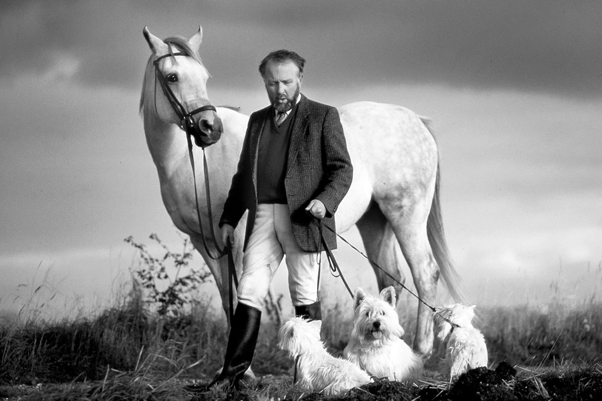
Recently I tried a black and white version which I rather like. I posted it on Instagram and it produced quite a lot of favorable comment.
I’m actually not sure which I prefer. I’ve included them both above. If you click or tap on either image you will get a bigger version.
I am curious to know what you think. Color or Black and White (for this image)? The magazine used it in color but then I didn’t give them a choice.
I know it’s been a long time since I did a blog post but I am going to try to post regularly. I hope to hear back from you. Let me know what you would like to read about. And if you have a blog, send me the link.
I am always keen to hear from you. You can contact me any time with questions or feedback.


I normally go for black and white photos, as there is a timelessness to them, but in this instance I prefer the color photo. I think it’s because the dark sweater and jacket are so close in tone in the black and white photo, and the contrast is less noticeable. I love the light on the dogs and the horse.
Thanks Adrienne. I’m leaning towards the color one too when I look at them side by side. Much appreciated:-)
It is so hard for me to decide on this as both photos are stunning in their own right. While I do love the black and white, there is just something about the color photo that is so striking. I think it’s the contrast between the sky and the light color of the horse and dogs. In any case, they are both extremely striking.
Thanks Stacy! I think the color one slightly has the edge in this case too. 🙂
I just love the pop of red which to me really helps establish his character. And it balances against the blue sky. But both versions are very dramatic and memorable.
Thanks. I agree that color is probably best for this one 🙂
Hello David, I find it very difficult which of the two photos is my favorite!
With a slight preference I go for the colour one as the light is so unusual…enjoying your photos as always kind regards Dianne 🌷🌷
Hi Dianne. Thanks for reading the blog and leaving your feedback. I think the consensus is the color (colour) one:-) Thanks for the kind words. All the best, David
Hello Alison. Thanks very much for your detailed response! Yes, colour is definitely winning this and your reasons are spot on! All the best, David
Thank you for sharing your story and memories, David!
It’s always a delight to read your posts.
I wouldn’t worry on the frequency of those.
I believe we should allow ourself to feel free to post when we feel for it. In the world of obligations, your blog is your personal little country and you’re the head of it. You post when you feel the desire to do.
Said that, both pictures are beautiful.
I personally prefer the colour version. Because the colours and the light were beautiful at that moment and would be a “punishment” to hide those.
Looking forward for your new artwork on “people“.
Wishing you all the best!
Warmly!
Anna G
Thanks very much Anna:-) Glad you liked it and I appreciate the thoughtful feedback. Yes, this one is definitely meant to be in color! 🙂 David